Tri-State Trek Website
User Interface for cycling fundraiser

Visual Design, Information Architecture, Brand Identity Design, Responsive Web Design / Sep - Dec 2022 / Live website
Challenges
The Tri-State Trek’s website did not accurately reflect the significant impact of the unique fundraising event with 450 participants each year. Over the pandemic, alternative participation options, like virtual, were prioritized leaving the website cluttered and confusing.
Without organized information and participants/users find it more difficult to register and meet significant fundraising requirements.
Empower users to make informed decisions about clinical trials
Build effective tools that connect users to compatible trials
Provide different features that make it easy for users search trials
The Tri-State Trek website is the home of ALS TDI’s largest annual fundraising event that has raised more than $10 million for research.
Results
The redesigned portal significantly improved usability for hundreds of study participants by clarifying user tasks, addressing multiple use cases, and reflecting the mission of the study for participants. Within four weeks of the new portal launch, the study received a 20% increase in enrollment completion.
Pain Points
After getting feedback from participants, I categorized their comments into two insights:
Hidden Information: participants communicated that important information, like event dates and fundraising minimums, takes too much time to locate on the website
Central Resources: participants need easy access to resources and tools for fundraising and training so they can succeed
Starting the Design
-
![]()
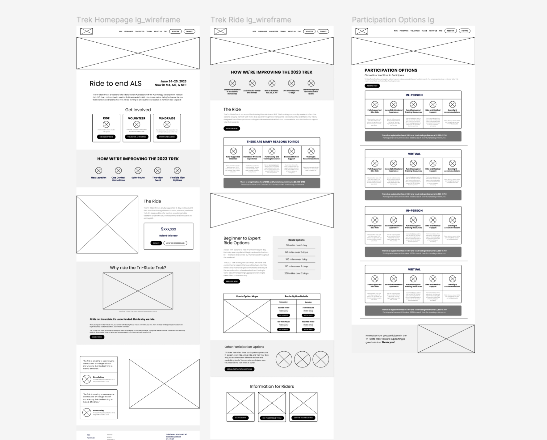
Digital wireframes
Wireframes designed for the task flow of learning more about participation options
-
![]()
Sitemap
Information architecture I organized while thinking through the flow of how users would find information about participating
-
![]()
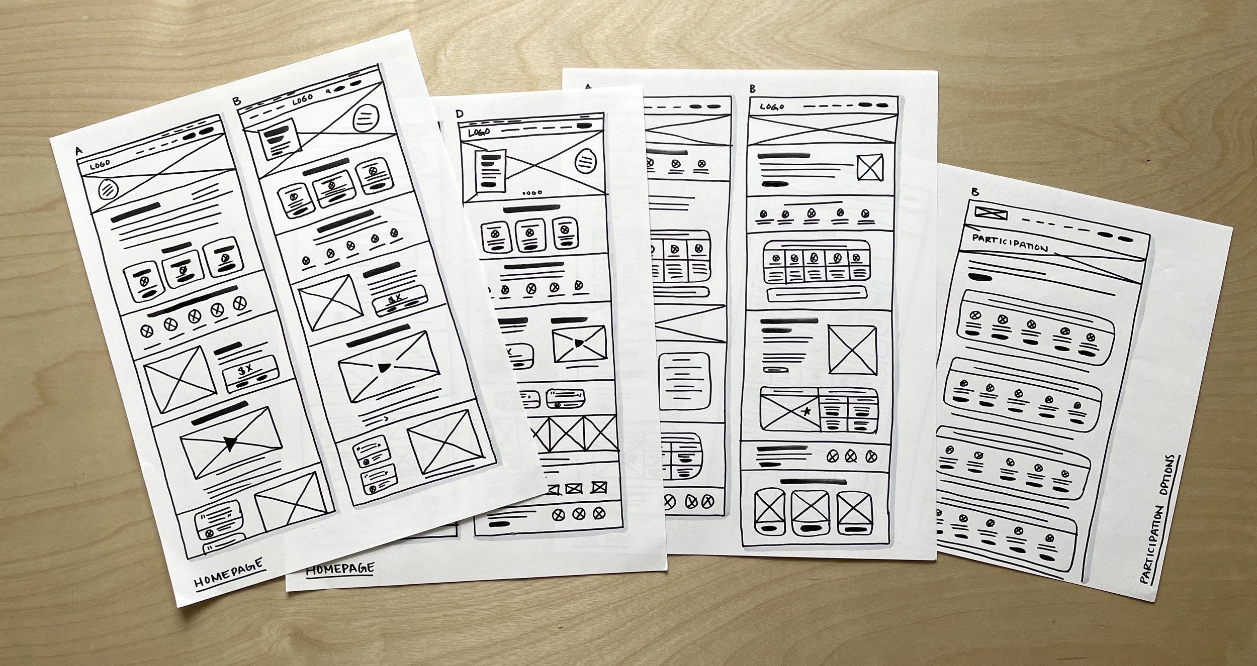
Paper Wireframes
I used paper wireframes to start thinking about how three key pages could be reorganized and redesigned to make the content more user friendly


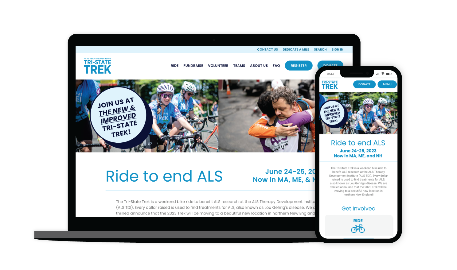
The Solution
The Tri-State Trek website makes it easy for participants to register, fundraise, and prepare for the weekend long event.
The brings awareness to the Tri-State Trek’s sole mission while making the user experience more enjoyable and increases funds for research.
Challenge 1
Clear information and benefits
Participation options clearly laid out in tables to provide an intuitive way to review benefits, fees, and more.

Challenge 2
Resources and tools
Resources for riders about training, fundraising, and the route all on one central page. Prioritizing in-person riders who need the most support and guidance by organizing helpful information.

Sticker Sheet
I created a set of iconography and design system to build a cohesive friendly and fun feel to the website.

Takeaways
Participants had a better experience when registering and converted more leads to participants, expanding the event.
What I learned
I learned that providing a more enjoyable and intuitive user experience helps grow fundraisers.
Next step
Iterate on the design based on feedback to continue prioritizing fundraisers who are imperative to the event’s mission